The MACD, its Signals, And The NYSE
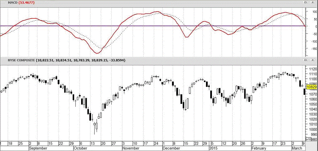
The discussion of this indicator is now on the “Market Review” page (go to “ Home “ for a current chart and explanations, but read the rest of this first). The link will take you to where 6 charts are displayed. The MACD is one of them. Since that chart is always changing, we left this one here for the purpose of illustration. In this chart, note the tendency of the NYSE to decline soon when the MACD is widely separated from and above its trigger line. It tends to rise soon if the MACD is widely separated from and below its trigger line. Note also how the NYSE declines when the MACD crosses below its trigger line and rises when the MACD crosses above its trigger line. Note also how these signals occur early, before the new trend developes much momentum. At the far right of the chart (late February), the ndex was above and widely separated from its trigger line. That is a warning that a decline may follow. Then the MACD crossed below its trigger line and the Index commenced its declining trend. These conditions do not always result in the illustrated moves. However, there is increased probability that the security being tracked will (like the NYSE in the above chart) act in a way that is consistent with these signals. ~ Dr. Felt .