wStock Market Review-Alerts – McClellan Oscillator – Summation Index – Chande Momentum Oscillator – Stochastic Oscillator – Market Bias
Cell Phones & Navigating this site
Time where this site is managed
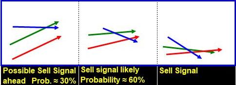 Below, Look for The Above Configurations
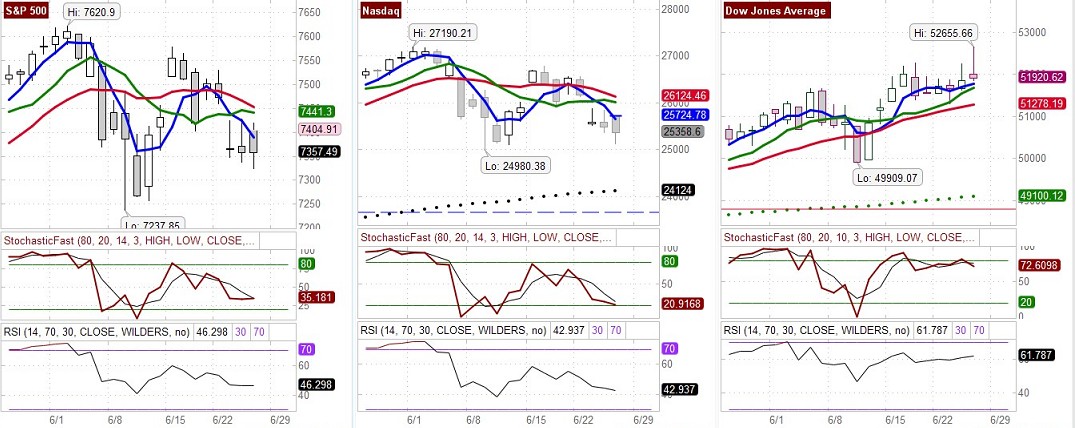 The above charts show the moving averages used with R.C. Allen’s trading system.
R.C. Allen’s Explanation of His System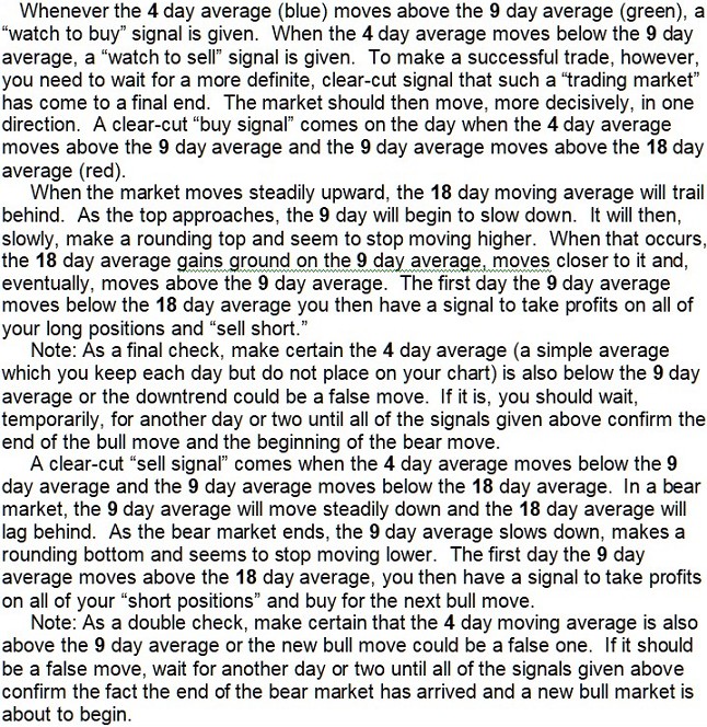
The Buy/Sell Signals of Two Excellent Systems
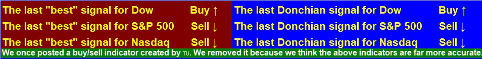
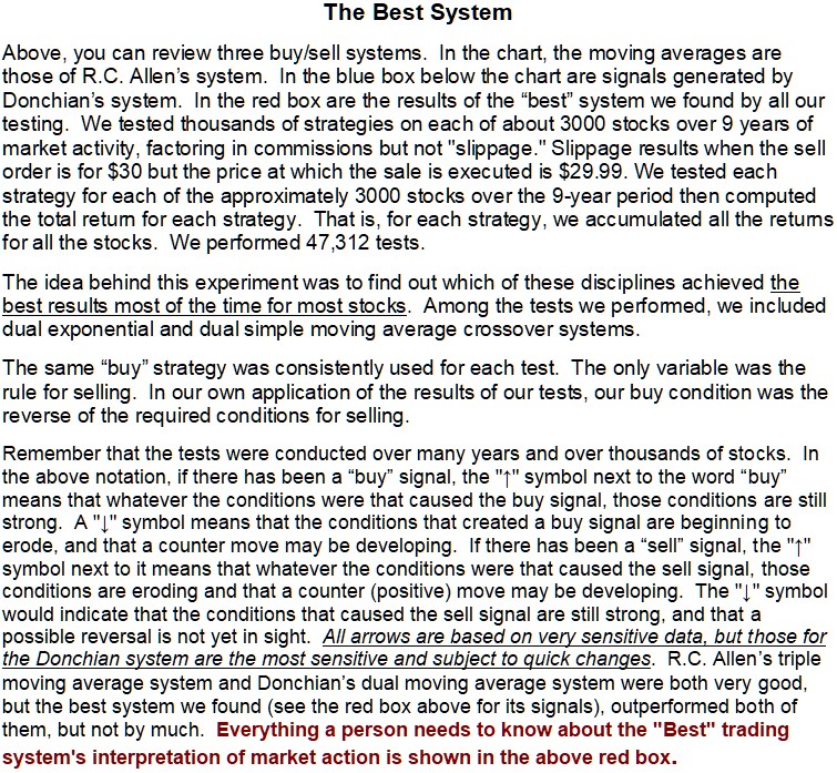 See also Donchian’s dual crossover system
R.C. Allen’s Triple crossover System
Friday, June 26, 2026
♦ The Dow last closed at 51920.62, up 71.72 points or 0.14%, the S&P 500 last closed at 7357.49 down, -0.73 points or -0.01%, and the Nasdaq Composite Index last closed at 25358.6 down, -118.0327 points or -0.46%.
U.S. Stock futures: Time: Friday, 4:25 AM Pacific (approximate)
S&P is down 36.75 points or 0.50%, the Nasdaq 100 Index is down 353.75 points or 1.19%, the Dow is down 65 points or 0.12% and the E-mini Russell 2000 is down 16.7 points or 0.55%.
U.S. Stock futures: Time: Friday, 5:18 AM Pacific (approximate)
S&P is down 20 points or 0.27%, the Nasdaq 100 Index is down 281.75 points or 0.95%, the Dow is up 44 points or 0.08% and the E-mini Russell 2000 is down 10.3 points or 0.34%.
U.S. Stock futures: Time: Friday, 6:00 AM Pacific (approximate)
S&P is down 43.5 points or 0.59%, the Nasdaq 100 Index is down 435.25 points or 1.46%, the Dow is down 121 points or 0.23% and the E-mini Russell 2000 is down 21.6 points or 0.71%.
♦ The U.N. International Maritime Organization paused its operation to escort ships through the Strait of Hormuz on Thursday after a vessel reported that it was attacked. The cargo ship said it was hit close to Oman by a projectile hours after Tehran warned vessels against taking routes that it had not approved.
♦ Stocks surged on Thursday morning as strong earnings and forecasts from Micron and Qualcomm helped refuel the AI rally. Asian markets surged after Micron said its customers had committed $22 billion for its memory chips, and Qualcomm indicated it anticipates $15 billion in sales from its data center business by 2029.
♦ U.S. President Donald Trump said on Tuesday that Iran had agreed to nuclear inspections into “infinity.” However, those in Tehran who were against the agreement previously made with the U.S. believe they now have, because members of the U.S. Congress have voted against additional military action, no need to follow through on the previous promise to allow nuclear inspections. Accordingly, the voices in Tehran that say there was no such agreement have become louder.
♦ The U.S. Senate backed legislation on Tuesday directing President Trump to halt U.S. military action against Iran. The Senate’s vote was 50-48 in favor of the war powers resolution, which passed the House of Representatives early this month. It is not known how it will affect the conflict, as Trump’s administration works to negotiate a peace agreement with Iran, but it will likely put U.S. negotiators at a disadvantage, rendering the time, lives, and other expenses, of the war effort less fruitful and with Iran benefitting more with fewer concessions. The timing of the resolution, was lousy from a military perspective, but positive from a political perspective, because representatives can boast that they voted against the war in their bids for re-election – Something most people are against (even Trump does not want war, but believes it was necessary) Under the War Powers Act, the measure does not get sent to the White House for Trump’s signature. However, the White House has insisted the legislation is not constitutional and therefore not binding. Experts say it remains a contested legal question that will have to be settled in the courts.
♦ President Trump said he will “do what I have to do” if Iran does not stick to its side of the agreement. Vice President JD Vance said talks with Iranian officials had laid a good foundation for a final peace deal, but Iran denies it had begun discussions on its nuclear program or agreed to invite International Atomic Energy Agency inspectors back to the country.
♦ Monday – SpaceX dropped 16.4%, weighing heavily on the Nasdaq Composite. However, it is still trading above its IPO price of $135 per share. Optimism about artificial intelligence has been lifting the market, but some analysts are fretting about the heavy spending on infrastructure expansion by hyperscalers. Alphabet fell 5% while Meta, Amazon, and Microsoft fell between 2.3% and 4.7%. However, some of the strongest fundamentals are within the AI data center buildout space. That includes both the hyperscalers as well as many of the components that go into that continued buildout.
♦ The upcoming Micron Technology earnings may be looked upon by investors as an indicator of whether or not chip demand is still accelerating. Micron’s report on Wednesday, June 24, may be seen as a gauge as to whether the surge in spending on data centers and the resulting profits generated across the semiconductor sector can continue to surprise to the upside.
Pivot Points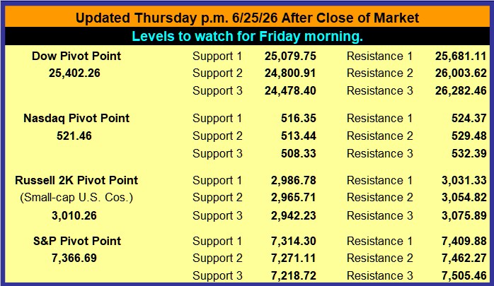 Pivot Point Explanation
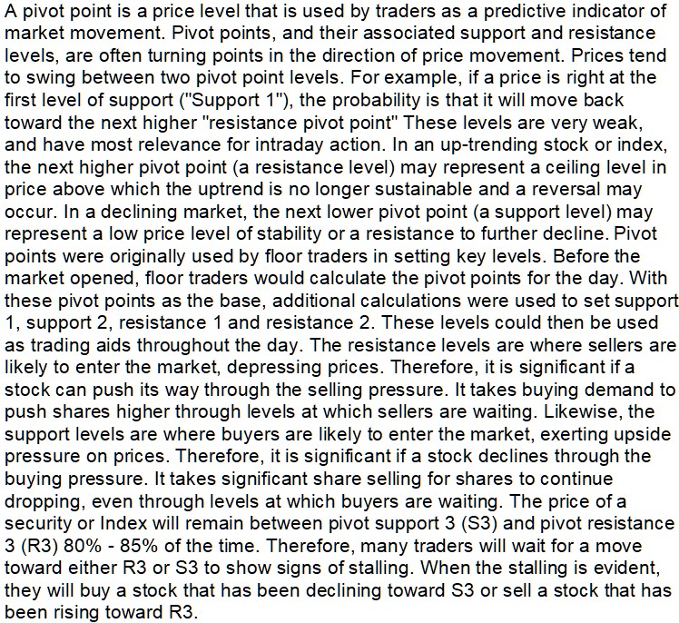
Market Status Report
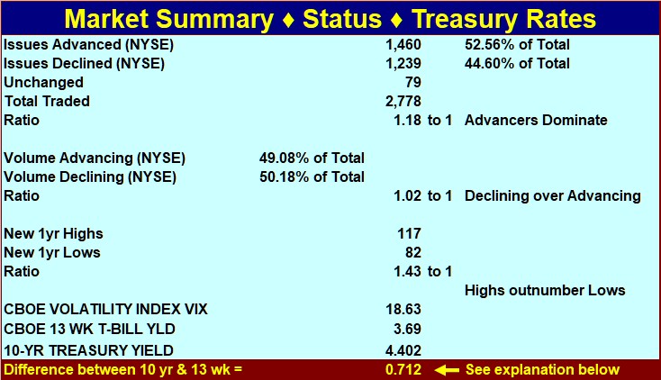 Explanation regarding interest rates (see last line in above table).
When short-term rates are 1.3% to 2% below long-term rates, the difference is positive, and investors expect normal economic growth (2-3 percent per year). When the spread is greater, they expect even faster growth because the Central Bank is likely pushing rates down. This reduces the cost of borrowing for companies so they can expand capital investment. When short-term rates are higher than long-term rates, Central Banks are probably trying to curb inflation. Economic conditions are expected to deteriorate. When short-term rates exceed long-term rates by 1.5% or more, there is a 70% chance the economy will go into recession within the next 12-months. The foregoing can serve as an investment guide. If short-term rates are higher than long-term rates, tighten stops or take other protective measures. If they are 1% or more higher, consider moving to cash (the short-term curve was this far above the long-term curve in 2000 and a 3-year bear market began in that year). When short-term rates are less than 1% below long-term rates, stable growth stocks are attractive. When short-term rates are 1% to 3% less than long-term rates, stocks are even more attractive (a stock-picker’s market). If the spread is more than 3%, invest with the premise that inflation could start to heat up soon.
McClellan Oscillator-Summation Index
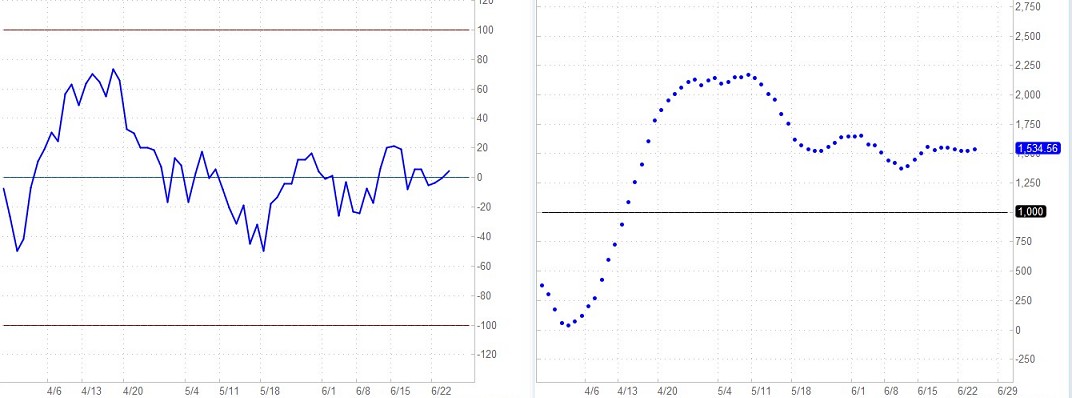
The McClellan Oscillator is a breadth-of-market indicator that is effective for interpreting short-to-intermediate-term market moves. The McClellan Summation Index (bottom chart) is a running total of each day’s McClellan Oscillator value. The Summation Index is effective for interpreting intermediate to long-term market moves. Together, they can be useful in evaluating the dynamics of the ebb and flow of the market, and in planning entry and exit points.
McClellan Oscillator readings of ±150 are extreme and tend to correlate well with buying and selling climaxes in the market. The McClellan Oscillator reaches these extreme values, measuring overbought and oversold conditions, in advance of market turns. It then passes through zero (the black dotted line) at or very soon after market turning points (to put this in perspective, extreme readings occur much less frequently than a pass through zero. McClellan Oscillator passes through zero tend to indicate market reversals at approximately 2 to 6 week intervals). The type of action to be taken, if any, depends on the major trend of the market (as indicated, for example, by 50 and 200-day moving averages) and on whether the move originated from an extreme reading. Thus, in the early and middle phases of a bull market emphasis might best be placed on buy signals. In a bull market, buy signals occur earlier, and positions can be taken when the McClellan Oscillator clearly moves out of its basing pattern, even if it is still negative. In a bear market, sell signals occur when the oscillator moves clearly out of a topping formation, even if it is still positive. The amplitude of the oscillations above and below zero correlates with the general volatility of the market. The oscillator shows distinct cycles (lasting 22 to 24 weeks) between significant bottoming formations. Divergence between oscillator moves and conventional market indicators forecasts an impending change in market direction. Conventional trendline theory can be applied to oscillator patterns. For example, a triple top formation in the McClellan Oscillator forecasts a termination of the preceding up-trend.
The Summation Index is a relative number, depending on the day when the count begins. Therefore, on one day it might read 10,000 and the next day it might read 9,000 even though the chart shows the Index rising. In this case, the apparent discrepancy would simply be the result of the summation starting on a later day for the chart selected. You can get a better sense of what is going on by simply looking at the chart. Ask yourself questions like the following. Is the Summation Index rising or falling? Are the postings far apart or close together? For example, if the Summation Index is rising (or declining), it is intermediate-term bullish (bearish if declining) and the market’s trend is up (down if the Summation Index is declining). If the Summation Index is declining, the first positive sign will be a slight narrowing of the gaps between postings. The second positive sign the Summation Index will give is a flattening out of the entries (this stage is sometimes skipped). The third positive sign is a reversal in direction. The final positive sign is a slight increase in the distance between postings. Some investors use the latter as a buy signal (alternatively, some may use the second posting in the new direction as an early buy signal). They view the opposite conditions as negative, culminating in a sell signal.
News Items![]() .
.
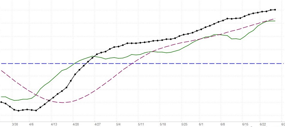
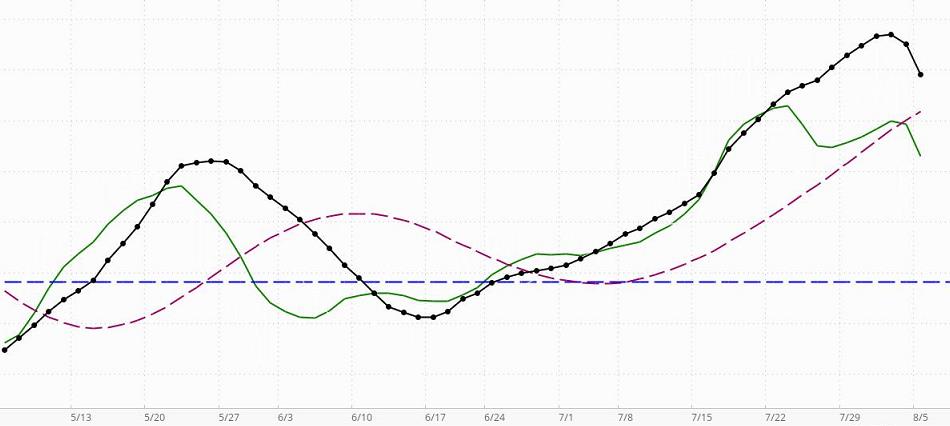
This is updated daily. When the black line with dots (the indicator line) is above the horizontal blue line, this indicator is telling us that the market has a positive or bullish bias (in the short-term to intermediate-term, even if not in the long-term). If the black dotted line is declining toward the horizontal line, bullish sentiment is decreasing but still present. A negative or bearish bias will be indicated when the black line crosses below the horizontal line.
Assume, that the market has a positive bias (the black line is above zero). If the green line is rising, it is confirming that the environment is supporting bullishness. In this case, long-term and intermediate-term investors who take bearish positions will be in an environment that is working against them. A declining green line in a market with a positive bias means the positive bias is not currently being confirmed … the MBI is detecting counter-currents of negative momentum that are not yet significant enough to change the market’s positive bias status. That means investors may find situations where bearish positions can be taken with somewhat less risk than when the market has a confirmed bullish bias, but because the general environment is bullish, there is still risk in taking bearish positions. Great caution is recommended. Money can be made only on carefully selected bearish positions taken by short-term or intermediate-term investor/traders who know how to trade bearish positions in a market with a positive bias. If the black indicator line crosses below the dark red dashed line, it means that the bearish sentiment is becoming more significant, but since the black line is still above zero, probabilities still favor bullish positioning. In this environment, carefully selected bearish positions are more likely to be profitable than before the black line crossed below the dashed line. From the perspective of an experienced short-term trader, the non-confirmed reading is giving a “go-ahead” for quick bearish trades. Here, the indicator would be giving nuanced information a level deeper than most indicators. If the market has a positive bias, a green line turning down merely means the conditions are not “optimal” for short-term bullish positions. That does not mean they cannot be very profitable if carefully chosen. However, a downturn of the green line in a market with a negative bias is much more problematic for bullish positioning, even for very short-term traders.
Assume, that the market has a negative bias (the black line is below zero). If the green line is declining, it is confirming that the environment is supporting bearishness. In this case, long-term and intermediate-term investors who take bullish positions will be in an environment that is working against them. A rising green line in a market with a negative bias means the negative bias is not currently being confirmed … the MBI is detecting counter-currents of positive momentum that are not yet significant enough to change the market’s negative bias status. That means investors may find situations where bullish positions can be taken with somewhat less risk than when the market has a confirmed bearish bias, but because the general environment is bearish, there is still risk in taking bullish positions. Great caution is recommended. Money can be made only on carefully selected bullish positions taken by short-term or intermediate-term investor/traders who know how to trade bullish positions in a market with a negative bias. If the black indicator line crosses above the dark red dashed line, it means that the bullish sentiment is becoming more significant, but since the black line is still below zero, probabilities still favor bearish positioning. In this environment, carefully selected bullish positions are more likely to be profitable than before the black line crossed above the dashed line. From the perspective of an experienced short-term trader, the non-confirmed reading is giving a “go-ahead” for quick bullish trades. Here, again, the indicator would be giving nuanced information a level deeper than most indicators. In a market with a negative bias, a rising green line is letting an investor know that if they are very careful, there are some opportunities. For example, a setup pattern could offer a good opportunity for a 1-week price surge [a pre-surge “setup” pattern is meant here. For more on these patterns see the bottom half of the Stock Alerts page on this site]. A swing-trader may take such a position to participate in the surge and sell immediately as the surge loses momentum. These trades can enable a person to capture a gain of maybe 3% to 12% and sometimes much more than that (we have captured more than 30% in a single day).
As for the green line, its position above or below either the black Indicator line (or Dashed red line) is not relevant. It is the direction of the green line, not its position, that is relevant.
The dashed red line can be used in combination with the black dotted line as a short-term buy/sell signal generator, but all signals must be confirmed by the green confirmation line. For example, say the black dotted line is below the horizontal line (indicating a negative market bias), and it crosses above the dashed dark-red line. If, at the same time, the green line is rising, then a cross above the red line may be interpreted as a buy signal in a negative environment for a short-term trade. All such signals must be viewed with respect to the prevailing context and the risks implied by the current configurations. Nothing on this Website should be interpreted as a buy or sell recommendation. Our indicators may generate buy or sell signals, but never buy or sell recommendations.
So, what if the Indicator line is above zero (indicating a positive bias), but it has crossed below the broken red line? If the green line is declining, it is confirming that bearish positions can be taken within the bullish environment. However, it must be remembered that risk is higher than if the market has a bearish bias. If the green line is rising, it is not confirming the short-term sell signal created by the Indicator line crossing below the red dashed line. Instead, it is confirming the positive bias indicated by the black indicator line’s position above the zero line.
On the other hand, if the Indicator line is below zero (indicating a negative bias), but it has crossed above the broken red line, simply reverse what was said in the above comments. This indicator is sensitive. For example, it gave a “sell signal” two days before the market meltdown in 1987. More information on MBI
CMO, STO, RSI, CCI, Demand Index
Interest Rate Spread (%) & VIX 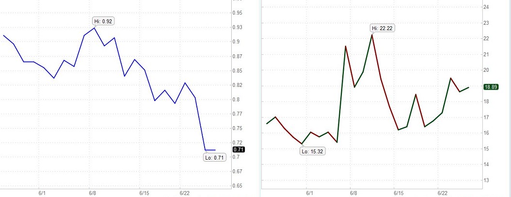
Interest Rate spread The left chart above shows the difference between the long-term (10-year) and short-term (13-week) interest rates over recent months. When the spread between short-term rates and long-term rates is +1.3% to +2% (short-term lower than long-term), the economy is thought to be in for a normal growth rate in the vicinity of 2% to 3%. If the difference is more than that, it is probably because the Central Bank is making money more easily available and the economy will likely undergo accelerated growth. When companies can get cheap money, they can more easily afford to invest in projects, facilities, and equipment that will expand business or improve operations. If the interest rate spread is negative (short-term money more expensive than long-term money, then money is being made more difficult to obtain by the Central Banks (they are attempting to reduce the rate of inflation). This will, of course, slow down the amount of capital investment made by companies. Economic expansion will be mitigated. If the spread is a negative 1.5% (or even more), then the probability is 70% that economic recession will occur within a year. This information can be the basis for some general guidelines. If the spread is negative, make stop losses hug price action more snugly and use other techniques you may be aware of to guard or enhance assets in the event of market decline. If the short-term rate is enough higher that the interest rate spread is -1% or more, cash might be your best option. If the chart indicates that the current spread is .76, then the current spread is a little more than ¾ of 1%. The fact that the number is positive (the line is above zero) means the long-term rates are greater than the short-term rates. If the number is negative (the line is below zero) it means the short-term rates are greater than the long-term rates. a.) If the spread is negative, tighten stops or take other protective measures. b.) If short-term rates are 1% or more higher than long-term rates, cash might be a more appropriate investment (Remember that the bear market that began in 2000 started under these conditions). c.) When the spread between short-term and long-term money is less than 1%, higher-quality growth stocks are better candidates. d.) When short-term money costs 1% to 3% less than long-term money, stocks are generally even more likely to be profitable. A greater variety of stocks will advance in valuations. e.) If the spread is more than 3%, assume that inflation is just around the corner.
VIX VIX values greater than 30 are generally associated with a large amount of volatility as a result of investor fear or uncertainty, while values below 20 generally correspond to less stressful, even complacent, times in the markets.
A low VIX, a range of 20 to 25, indicates traders have become somewhat uninterested in the market and generally indicates a sell-off. The value of VIX increases as the market goes down and decreases when the market moves in an upward direction. A rising stock market is seen as less risky and a declining stock market more risky. The higher the perceived risk in stocks, the higher the implied volatility and the more expensive the associated options, especially puts. Hence, implied volatility is not about the size of the price swings, but rather the implied risk associated with the stock market. When the market declines, the demand for puts usually increases. Increased demand means higher put prices and higher implied volatilities.
For contrarians, comparing VIX action with that of the market can yield good clues on future direction or duration of a move. The further VIX increases in value, the more panic there is in the market. The further VIX decreases in value, the more complacency there is in the market. As a measure of complacency and panic, VIX is often used as a contrarian indicator. Prolonged and/or extremely low VIX readings indicate a high degree of complacency and are generally regarded at bearish. Some contrarians view readings below 20 as excessively bearish. Conversely, prolonged and/or extremely high VIX readings indicate a high degree or anxiety or even panic among options traders and are regarded at bullish. High VIX readings usually occur after an extended or sharp decline and sentiment is still quite bearish. Some contrarians view readings above 30 as bullish.
Conflicting signals between VIX and the market can yield sentiment clues for the short term, also. Overly bullish sentiment or complacency is regarded as bearish by contrarians. On the other hand, overly bearish sentiment or panic is regarded as bullish. If the market declines sharply and VIX remains unchanged or decreases in value (towards complacency), it could indicate that the decline has further to go. Contrarians might take the view that there is still not enough bearishness or panic in the market to warrant a bottom. If the market advances sharply and VIX increases in value (towards panic), it could indicate that the advance has further to go. Contrarians might take the view that there is not enough bullishness or complacency to warrant a top.
What’s In The Valuator?
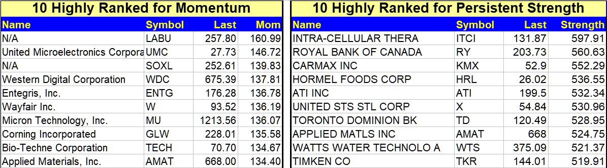
Stocks With Highest Persistent Strength Ranking
See what this means
Stocks With Lowest PE-Ratios
Probable High and Low Price Range For Each Stock
Stocks With Lowest and Highest RSI
10-Day Momentum For each Stock
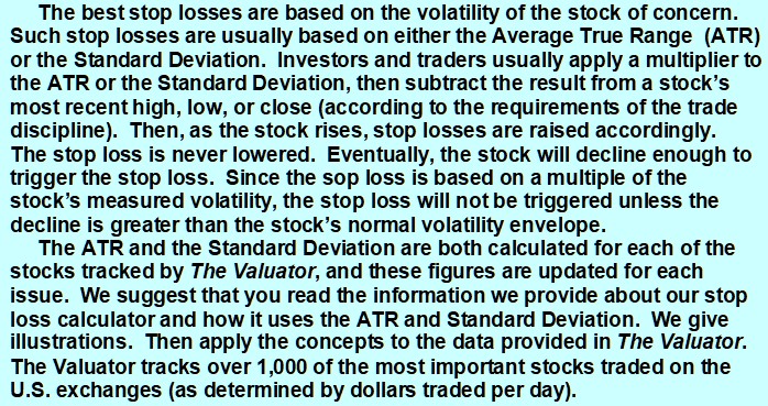
The ATR (Average True Range) and the Standard Deviation
For Each Stock, both of which can be used
to compute a stop loss setting.
![]()
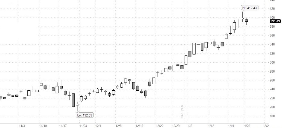
A Valuator “Strong Stock”
Stocks With High Momentum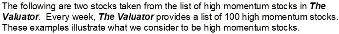
SETUPS: Increase your odds of making a profit by focusing on “setups,” chart configurations that are most often seen before a price surge. Be sure to wait for the “trigger event.” A “trigger event” is your buy signal, assuming there is not overhead resistance or other contrary indications. For more on setups, go the Q&A page and read item 13. Then use the link at the end of that explanation.
The Trading Result For One Of Our Traders
Long ago we proved to our own satisfaction (by trading with real money) that to obtain gains of more than 50% a year it is not necessary to invest in options, currencies, or commodities. It can be done simply by buying and selling stock. All you need is a good discipline (and that you actually follow your discipline). That is what this site is all about. We do not make a practice of revealing the performance of company traders. There is little reason to do so, and it is nobody’s business but our own. However, one of our traders has given permission for us to share her performance on a one-time basis.
After brokerage fees, her net return for the year was 58%. All she did to obtain this return was to buy and sell stocks in a very bad market. She simply cut losses quickly, focused on good setups, and looked for trigger events. When it was time to sell, she did not talk herself out of it or “argue” with the evidence. She also did not sit “glued” in front of her computer. She entered her trades and set her stop losses. Often, the only time she could check her positions was long after the market closed. She did not have to agonize about margined positions held overnight because they were not part of her discipline.
It might also be worth mentioning that to optimize liquidity, to minimize the spread between bid and ask, and for risk-control reasons, she prefers to avoid stocks that trade for less than $5. Most of the stocks she trades are followed in The Valuator. This trader is a very private person who does not want to report her returns every year, so there is no plan to update this performance in future years. This report was posted shortly after the data was available, and it will be left here for future visitors.
Please be aware that she did have major distractions during this year that almost certainly got in the way of her achieving a significantly greater return. In other words, this was by no means the best she could do. However, she allowed us to reveal her performance anyway in order to encourage others and to show that returns above 50% are achievable (even under less than ideal conditions). [Portfolio returns above 50% per year can be achieved by trading relatively high quality stocks priced above $5 in a cash account.
The discipline used by this trader is extremely low in risk, much lower than the risk assumed by the average mutual fund investor or the buy-and-hold investor in individual stocks. Yes, she could have achieved a much higher return if she had kept her positions highly leveraged. She does not wish to take that route. Greed destroys discipline. Here is a little known fact worth considering. 80% of the people who fully leverage their investments in the futures markets eventually lose all their money. Some people do well in the futures markets. The same can be said for some who trade penny stocks and currencies. However, it is not the use of leverage that makes a winner, but the use of a good discipline. Too many people don’t get that fact.
The discipline used to achieve the above return is our own creation. We do not make it available to the public as part of any service or training program. In other words, we are not providing this performance information to solicit your enrollment in any kind of program. It is provided only to encourage people to be diligent in the development of their own discipline. We will leave this report here to encourage others who may be wondering if working at developing a discipline is worth the effort.
=========================
Gold, Silver, Platinum, Palladium, Rhodium