Strongest Stocks
Ranked Lists of The Strongest Stocks
To find some really strong stocks, look at the “Strength Rank %” column in The Valuator. The top 10% in strength have a rank of 90% or above, and since there are more than 1,000 stocks being tracked in The Valuator, it includes more than 100 that are in the top 10%. At the bottom of the Strength Rank column of The Valuator, we put the rank necessary for a stock to be among the top 75 out of more than 1,000. We do the same thing for 10-day momentum, % to C.G., 14-day RSI, and 14-day CCI. In addition, to the right of the Strength Rank column, we place a “◄” if the stock ranks in the top 75 for strength. To find a good entry point for those stocks, it can be helpful to review them with interval charts. For example, a twenty-day chart showing 1-hour intervals rather than day intervals reveals the smaller “pullbacks” more common with those stocks. On the other hand, some people simply look for attractive charts based on days rather than hours and “jump on board” using close stop losses. It is possible to get a 1-month return in some of these stocks that most people would be elated to see in a 1-year investment (sometimes, only a week will do it). Each stock tracked by The Valuator has a “Persistent Strength” percentile ranking, so you can quickly determine if a stock is in the top 25%, top 15%, or whatever. Our algorithm looks for “Persistent Strength.” To learn how this measurement can find stocks that are much more likely to keep climbing than those found by the RSI, read the following.
What do we mean by “Strength” & “The Strongest” stocks?
When we say a stock is “strong,” we are referring to strength that is far superior to that measured by the Relative Strength Index (RSI), a mathematical tool popular with traders. The word “relative” is misleading when used in reference to the Relative Strength Index. Unlike our own algorithm, it is not a measurement of how strong a stock is relative to other stocks, and it is usually based on a “snapshot” time frame of only 14 days. However, it is a very useful tool with which Traders look for a divergence between the Relative Strength Index and the price action of a stock. If the stock makes a new high but the Relative Strength Index does not, this divergence suggests a reversal is likely. The Relative Strength Index is a rather simple measurement that is based on the ratio of upward price changes to downward price changes over 14 days. Thus, it is also useful in finding stocks that have just surged in price. It is therefore included in The Valuator. Our own strength indicator is far more complex. If you scan 2000 stocks with the Relative Strength Index, you will often find that the stocks that rank high are NOT attractive because of overhead resistance or because the surge of strength measured is not really significant for some other reason (a non-significant rebound in a bad pattern). The latest surge may be only a snap back reaction toward the previously penetrated neckline of a head-and-shoulders pattern (a very bearish configuration). The list selected by our own strength screens, however, will actually look far more attractive on a visual inspection. The more stocks that are screened, the greater the difference in output will be. When you look at our highest ranked “strength” stocks, you will know you are looking at stocks that are really strong
The Problem With Basing Strategies on the RSI
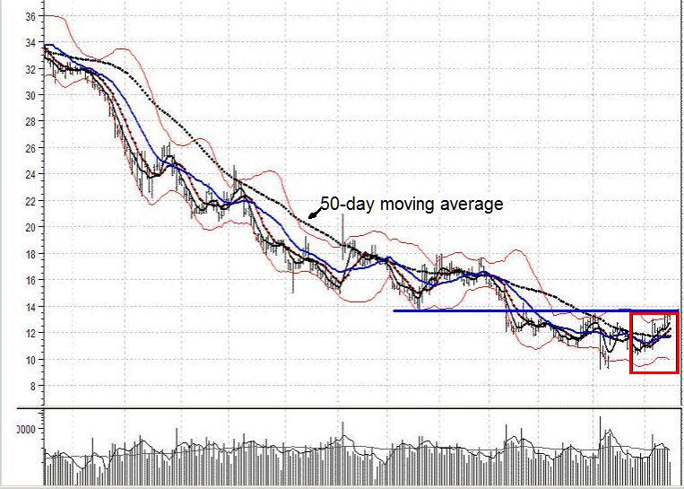
The following was a highly rated stock based on its RSI (Relative Strength Index) reading. Measurements were taken on over 2000 stocks. They were then ranked in the order of their scores. The following chart shows a stock highly ranked by the RSI. In the chart, 14 days covers only the last rise in the stock but misses the times the blue line acted as support or resistance. When the stock approaches the horizontal line from below, hits the line and then falls, the line is acting as resistance. When the stock approaches the line from above, hits the line and bounces, the line is acting as support. That blue line is significant and at the time of the last 14-day price increase, it will act as resistance. The probabilities are very high that the stock will be turned back again. Look at the next chart. The symbol for the stock is MNTA. If a line acts as resistance 6 times and as support 3 times (as in this chart), all 9 times count as support or resistance, depending on whether the stock is above or below the line. In the chart, the stock is below the line. Therefore, we have 9 times in which the horizontal line has been tested and 9 times in which the stock has been turned back. The price is currently approaching the line for the tenth time. Every time a stock approaches a line of resistance and the stock is turned back, the line becomes stronger. A future check of the stock’s chart will probably show that the stock did head south again after the date the chart was posted here. [We recently updated the chart and you can see what happened afterwards] The problem is that the RSI cannot see or “understand” that this is not an attractive stock because it cannot “see” beyond the last 14 days (the blue box in the chart). It sees only the last move upward. This stock was rated in the top 20 for strength out of thousands according to the RSI. Our own algorithm rejected it outright. It should be clear then, that though the RSI can find stocks that show recent strength, it can also turn up many stocks that are unattractive because of their overall pattern. What this means is that using the RSI to sort through thousands of stocks in an attempt to find the strongest will often result in a list that includes hundreds of stocks with unattractive patterns that must be visually inspected before being rejected as unattractive. There are better ways of using your time.
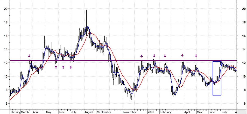
The following is a close-up of the same stock that shows what happened next.
Our own strength algorithm can “see” more of a stock’s behavior pattern. If our algorithm ranks a stock highly, it is far less likely that the stock has created a pattern of overhead resistance that is just above the current price. There is no way that our algorithm would select a stock like the one in the above chart. The stocks ranked highly by our algorithm are much more likely to have charts that are similar to the following chart taken from an actual report. All the charts in the report, and there were dozens, had variations of this pattern but they were all very strong with occasional minor pullbacks. All strong trends eventually come to an end. The point is that these stocks tend to have a higher probability of maintaining the trend for a little while.
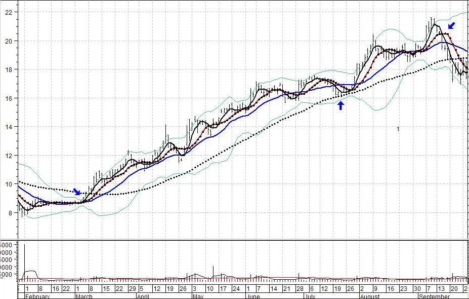
We have shown the above chart so you can see what we mean by “persistent strength.” Our reports have many stocks like the one illustrated, many if not most of which are earlier in their trend. Despite occasional pullbacks, this pattern is very strong. The pullbacks can be used as excellent entry points. Please ignore the arrows in the above chart. The chart has been used to illustrate some points other than strength, and we did not think it necessary to remove them.
One of Our Preferred Strategies
We put such charts on a “watch list” and wait for them to approach their line of support. That line of support may be a straight line like the one in the following chart, or it might be the curved line of a moving average (the broken line in the chart represents the 50-day moving average).
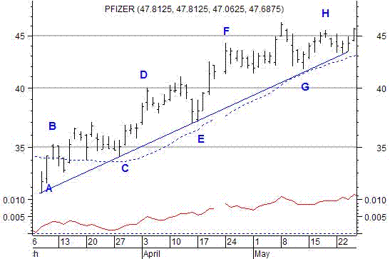
We are not interested in buying the stock when it is at “B,” “D,” “F,” or “H.” However, we are interested in buying the stock when it is at “C,” “E,” or “G.” This particular strategy follows the advice of Jesse Livermore who said that “It is essential to make sure the lines of least resistance are in the direction of your trade before entering the trade.” The overall momentum of the stock, as illustrated by the rising trendline and the rising moving average, increases the odds that the stock will rebound from this line of support and move to higher levels. If the stock drops below the line, we will know it is time to sell. Since we will not buy unless the stock is close to this line, any loss we might suffer would likely be minimal. The person who buys at “D” or “F” will suffer a much greater loss. A move from “D” to “E” is normal for a rising stock. A person who buys at “D” does not have sufficient reason to sell when the stock declines to “E.” Only if the stock were to decline significantly below its rising trendline, would a person be given a reason to sell. Therefore, the loss for a purchaser at “D” would be equal to the decline to “E” plus the distance of the stock below “E” at the time of sale. The loss would be far more than for the person who buys at “E.”
The above strategy is one of the favorites of our own traders. Sometimes we use variations on the strategy. For example, the rising trendline might be part of the right side of a cup and handle formation or of some other formation we like to trade. We may also use Bollinger band strategies in conjunction with it. This pattern helps reduce and define risk. The algorithm does not require that a stock be in an aging uptrend before listing it. But even if it did, an aging uptrend is far more attractive than no trend. Even aging trends have positive bias, and that is extremely helpful in a short-term trade. Actually, a stock could be included in a “highest strength” list when it is only one-third to one-half of the way to the ultimate price for its current trend.
Our algorithm and the RSI will both see the following types of pattern as attractive. The RSI will see it as attractive because of the last surge in price (see inside the boxed area). The difference between the RSI and our algorithm is that ours would not have selected the stock if it were not for the extended rise before the pullback. The RSI would not detect the extended rise. Obviously, this stock broke its pattern and would probably have been sold when it did so. However, an experienced trader might then have put the stock on a “watch list” to watch for a new entry point. This is an example of where fundamentals can come into play. If the stock has reached its “fair value” or “center of Gravity” (see the discussions on “fair value” in the section of the site pertaining to The Valuator), the stock is not as likely to climb significantly beyond its current level. If it is still below “fair value” it could go much higher. Of course, we would look for a signal that it “intends” to do so. We might have bought this stock a few days ago as a swing trade, but we would not buy it at this point. On the other hand, we might be interested again if it can climb above its previous high on convincing volume.
[It is standard practice to use the RSI to find strength in stocks because it is a cheap, quick, and easy pre-packaged upload for websites that do not have the mathematical expertise necessary to create more effective screening algorithms. At Stock Disciplines we do our own “number-crunching,” model creation, system testing, and algorithm development.] Sometimes the stocks selected by the two methods will resemble each other, but the RSI will often rank a stock highly even though it has a terrible chart configuration and dominating overhead resistance nearby while completely missing a stock with a much better chart pattern or even a pre-surge “setup” and more persistent strength. Our point is that, almost without exception, other websites that list “strong” stocks use the RSI as their measuring tool. Our strength algorithm is much more complex than the RSI. It is the result of our own research and effort and is definitely not a “cookie cutter” upload from a data vendor. It is proprietary and it is not available to other websites. It is far better at finding stocks with persistent strength than the Relative Strength Index (RSI) or other “relative strength” measurements.
Our traders love to use this algorithm because it helps reduce risk. That is, most of the stocks it ranks highly have demonstrated “durable strength.” That does not mean that they will necessarily continue to show strength, because all things and conditions eventually come to an end. However, it does mean that they have shown evidence of a strong upward bias. When you buy any stock, it can do only three things. It can go up, down, or stay the same. We believe that a strong upward bias “tilts” the outcome in our favor. This brings us to an important consideration. If you are looking for strong stocks, do you want a list where the stocks will all be different in a day or two or are you looking for stocks that will still be among the strongest in two or three days or even longer? Many of the stocks on our lists will still be listed on our strongest stocks list (probably with a different ranking) after a week and others may be there after a month, or even much longer.