Market Bias Indicator (MBI)

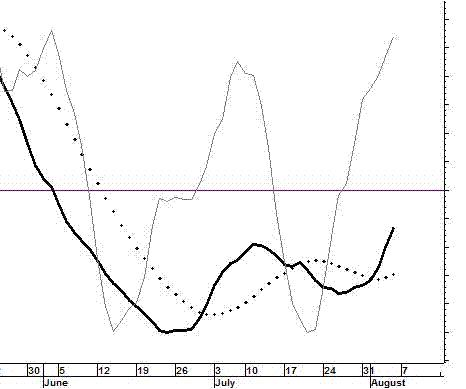
This illustrates the MBI in its original configuration.
It is now configured with three panels. More on that later
The Market Bias Indicator (MBI), also sometimes referred to as the Felt Oscillator, was created by Dr. Winton Felt in the 1980’s. It is proprietary. The factors, variables, and procedures used in its construction have never been published, and it is not available anyplace else on the Internet, unless it is being copied from this site. If you find it someplace else, please let us know. ~ Stock Disciplines
The current Market Bias Indicator (MBI) is displayed on the “Home” page. The page you are on right now illustrates some points that can be made about the above chart. According to the above chart, the market has a negative bias (the heavy black line is below the horizontal line). The indicator is rapidly moving toward a positive bias (the positive bias will be indicated when the heavy line crosses above the horizontal line). The fact that both the indicator line and the confirmation line are rising tells us that money can be made on bullish positions taken by short-term traders who know how to trade in a market with a negative bias. At the time pictured above, the overall tone of the market was likely to become positive soon.
In the above chart, there is a dark line, a dotted line, and a light line. In recent charts the light line is green. The following scenario illustrates how the green line can be used.
Assume the market has a negative bias and the green line is rising (it is the direction of the green line that is important, not its location. Whether it is above or below the black line is not relevant). [The green line is the “Confirmation” line. It confirms or does not confirm the location of the heavy line and its implications. A rising green line in a market with a negative bias means the negative bias is not currently being confirmed] … That would mean the MBI is detecting counter-currents of momentum that are not significant enough to change the market’s negative bias status, but they do suggest that very short-term bullish positions can be profitable. Therefore, from the perspective of a short-term trader, the non-confirmed reading merely gives the go-ahead for quick bullish trades. The indicator would be giving nuanced information a level deeper than most indicators. The bias is negative if the black line is below the horizontal line. Long-term and intermediate-term investors who take bullish positions will be in an environment that is working against them. However, the non-confirmed status gives another message to short-term and some intermediate-term traders.
Of course, it would be better, even for short-term traders if the market did not have a negative bias. The indicator is just letting them know that if they are very careful, there are some opportunities. For example, a setup pattern could offer a good opportunity for a 1-week price surge [a pre-surge “setup” pattern is meant here. For more on these patterns see the Stock Alerts page on this site]. A swing-trader may take such a position to participate in the surge and sell immediately as the surge loses momentum. These trades can enable a person to capture a gain of maybe 3% to 12% and sometimes much more than that (we have captured more than 30% in a single day).
If the green line turns down, while the market has a negative bias, we would not say that the opportunity for bullish positioning has passed, but we would say that the favorable climate is no longer there. Remember that we are talking about very short-term trading here. For short-term traders, the climate can change quickly. However, if the market has a positive bias, a green line turning down merely means the conditions are not “optimal” for short-term bullish positions. That does not mean they cannot be very profitable if carefully chosen. A downturn of the green line in a market with a negative bias is much more problematic for bullish positioning, even for very short-term traders.
————————————————————
[The above chart was generated about August 4, 2006. That chart and the above comments were the only content on this page until April 2, 2011. The above comments have not been modified to conform with what follows, but the green bracketed text above was added later to increase clarity.]

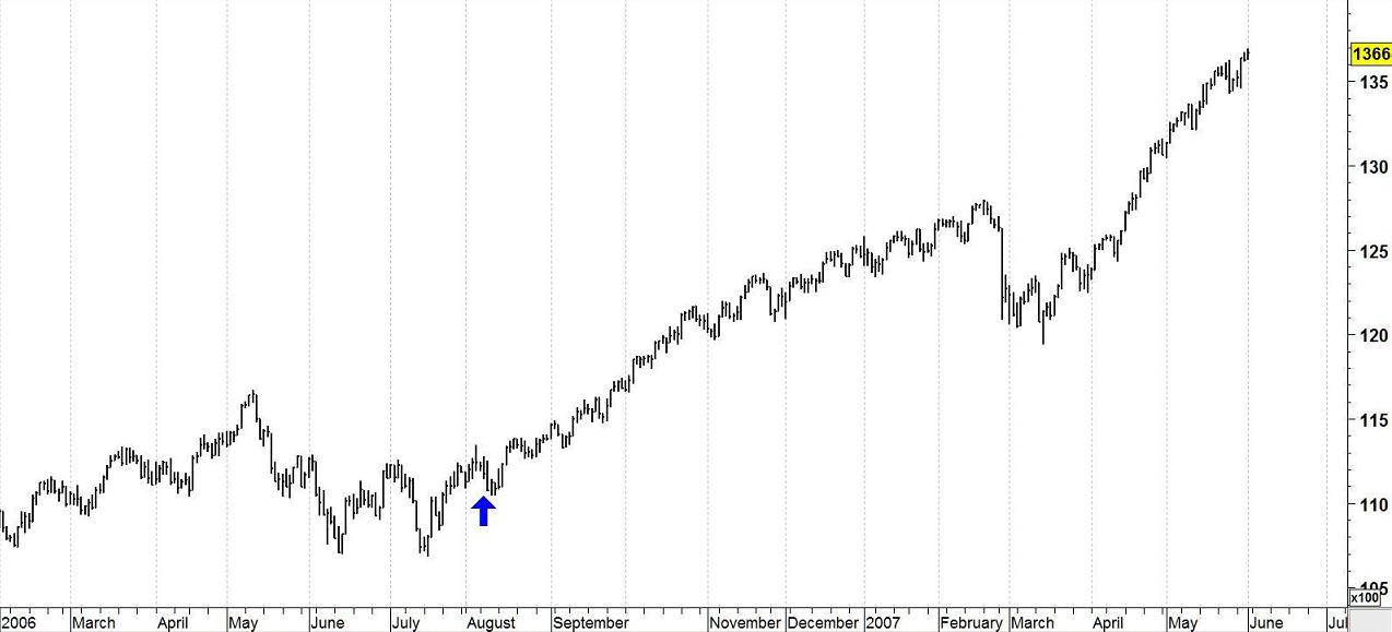
On April 2, 2011, we were reviewing this page of the Web site and decided it might be instructive to post a chart of what happened after the time shown in the first chart. The Market Bias Indicator turned to a positive bias on August 8, 2006. The chart of the Dow Jones Industrial Average is shown above with a blue arrow positioned at that date. The market did develop the positive bias predicted by the MBI.
