Stop Loss Probabilities
The Volatility-Adjusted Stop Loss & Probabilities
The Probability of a Stop Loss Being Triggered
Volatility-based stop loss placement can be optimized. A “volatility-based” or “volatility-adjusted” stop loss can be set so that it is unlikely that it will be triggered too soon because of a stock’s normal fluctuations. This can give a stock enough “wiggle room” to continue its climb with low risk of a premature sale because of a non-meaningful lurch of the stock. On the other hand, if the stock declines more than is characteristic for the stock given its own normal fluctuation pattern, the stock will be sold quickly with relatively small loss..
For some folks the next few paragraphs may be difficult reading. However, it is not necessary for you to get more than the general idea. If you like, scan over it quickly and move on to the paragraph after number 5 in the list that follows. On the other hand, if you can bear with us a moment, reading this should increase your understanding of why volatility-adjusted stop losses are among the best. and why the stops tool can calculate such useful stops.
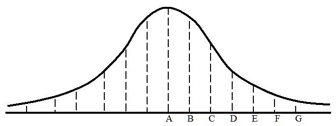
In a group of people that has a normal distribution of height measurements, the overall pattern of heights will distribute along a bell-shaped curve. If you compute the average height, the computed average will be at A in the diagram. Assume that each dash in the vertical line under the bell curve at A represents a man who is 5’10” or more in height and that this is the average height of 10,000 men in a sports arena. Let’s assume that these 10,000 men are represented by all the dashes under the curve but that most dashes are not shown (there are many vertical lines not drawn in the illustration). Those who are 2″ or more taller than those in column A are in column B. Those who are 2″ or more taller than those in column B are in column C, and so on with each column to the right representing men who are 2″ or more taller than the men in the previous column. By the time we get to column G we are talking about men who are about 6’10” or taller. Obviously, men who would qualify to be in each subsequent column would be increasingly scarce.
Instead of thinking about those dashes as men of a certain height, think of them as stock price spikes of a certain magnitude. Assume that downward spikes are to the right of A and upward spikes are to the left of A. For this discussion, we are interested only in downward spikes. Spikes that differ little from the average spike are near A and those that differ most are far from A. There are lots of small downward spikes that differ little from the average spike. They are located between A and B in the chart. As we move to the right on the A to G line, spikes get gradually larger. Though the spikes at C are larger than the spikes at A (like the taller men before), there are fewer of them. The very large spikes at E are fewer still. The even larger spikes at G are relatively rare. The height of the bell curve above any given location on the A to G line shows the frequency of spikes at that location.
Now we can think of the number of dashes under the bell curve at any given location between A and G as representing the probability that a spike of that magnitude will occur. For example, the probability that a spike will occur that is of sufficient magnitude to be at G is about 1.3 in 1,000. As mentioned before, the larger the spike the farther it is to the right on the graph and the less likely it is to occur. Statisticians use a standard unit of measurement in marking off distances from point A (the average) on the graph. This unit is called the standard deviation. The purpose of the diagram is only to illustrate the standard deviation concept.
Let’s now think of the placement of the letters B through G in terms of standard deviation distances from A. Let’s assume the letters A, C, E, and G are placed one standard deviation apart so that the distance from A to G is 3 standard deviations. Thus, the distance from one letter to the next is ½ standard deviation. It is a fact of nature, like Pi (π) is the same regardless of the size of a circle, that whenever we measure a randomly selected group for some trait which each member of the group possesses in varying degree, we may expect most of the measurements to bunch around the average, while the remainder taper off gradually toward both extremes of the distribution forming a bell-shaped curve. This is known as “Gauss’s Law,” and it describes any “normal” distribution in nature. By using the standard deviation as a measure of variance, we can know the probability of finding trait measurements of any magnitude. For example, in any large normally distributed set of trait measurements we know that trait measurements that are ½ standard deviation or more greater than the average (B in the chart) will occur 30.85% of the time. Again, this is a law of nature. Similarly, we know that
measurements 1 standard deviation or more greater than the average (C) occur 15.87% of the time.
measurements 1.5 standard deviations or more greater than the average (D) occur 6.68% of the time,
measurements 2 standard deviations or more greater than the average (E) occur 2.28% of the time,
measurements 2.5 standard deviations or more greater than the average (F) occur .62% of the time, and
measurements 3 standard deviations or more greater than the average (G) occur .13% of the time.
Our stockdisciplines.com traders use this information to approximate the probability of the occurrence of a spike of a specific magnitude (as represented by its distance from the norm in standard deviations). You can do the same thing. The word “approximate” is used because stock price variations are not exactly “normally” distributed. Assume for a moment that stock price spikes precisely followed a “normal” distribution or bell curve. Then a stop that is set at 1.5 standard deviations from the average price would be triggered approximately 6.68% of the time (see list above). Assume that during the last 20 days there were no special events that inordinately influenced the stock and that the same conditions prevailed over the next 100 days. In that case, spikes large enough to trigger a stop set at 1.5 standard deviations would probably occur about 6.68 times in 100 days or about once every 15 days simply because of the normal volatility or “noise” in the stock’s behavior. If we use 2 standard deviations, then a spike large enough to trigger the stop would occur about once every 50 days.
To compute a volatility-adjusted stop loss, it is necessary to measure price spikes and the approximate frequencies at which price spikes of various magnitudes occur over a given time. Measuring the distances of each day’s high and low from the average price over a given period will yield the needed data. This information can be used to approximate the probability of the occurrence of a spike of a specific magnitude (as represented by its distance from the norm in standard deviations).
How does this help? If your holding period is projected to be one week, you don’t need a stop loss that has one chance in a thousand of being triggered. Probably, one chance in three weeks (1 in 15) or four weeks (1 in 20) would make sense. On the other hand, if your holding period is 1 year (253 market days), you might require an event that has only 1 chance in 500 of being triggered because of the stock’s “noise” or random fluctuations. By placing your stop loss the correct number of standard deviations away from the stock’s average price, you can make it highly improbable that your stop will be triggered merely by the random lurches of your stock. In other words, volatility-adjusted stops enable you to set your stop loss just outside the probable “event envelope” of the stock’s price behavior. Hence, your stop will not be triggered because of the normal fluctuations in price. It would take a downward price surge that is not “normal” for the stock to trigger your stop loss.
For information about our volatility-based stop loss calculator go here