-Alerts – McClellan Oscillator – Summation Index – Chande Momentum Oscillator – Stochastic Oscillator – Market Bias
Cell Phones & Navigating this site
The Valuator 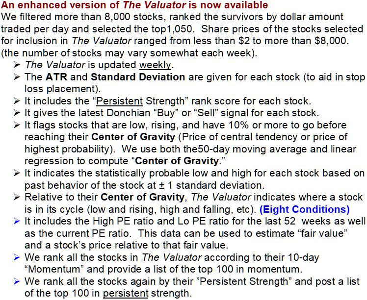
![]() For more information, see The Valuator See history, The Valuator
For more information, see The Valuator See history, The Valuator
The Valuator Video 1 The Valuator: Video 2
![]()
S&P 500, & Nasdaq
Click on chart to enlarge it 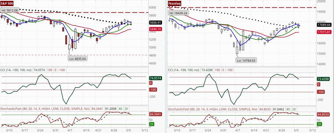
The PAL Report and Trading Forecasts
What is PAL? One-Day Probabilities
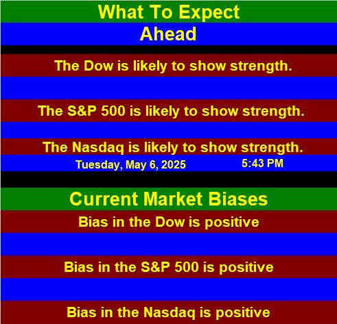
• The Dow is at 40829, down -389.83 points or 0.95%, the S&P 500 is at 5606.91 down, -43.47 points or 0.77%, and the Nasdaq Composite Index is at 17689.65 down, -154.5821 points or 0.87%. [The S&P 500 data previously shown here has been moved to the KISS information lower on this page.]
• A buy signal has been generated by the Dow. The 5-day average is rising. There will be increasing overhead resistance that begins to build at about 41,010 This support and resistance referred to here are not defined by fine lines. Rather, the odds of support or resistance gradually increase at these levels. There will be increasing resistance to decline that begins to build at about 40,648. See below, “What To Expect” to see if today’s pressures are more likely to be weighted toward buying or selling.
• We have a confirmed buy signal for the S&P 500. If the 4-day moving average falls back below the 9-day moving average, the buy signal will be given a non-confirmed status. For the S&P 500, the last signal generated by the Donchian system was a “Buy.” The 5-day average is rising. There will be increasing overhead resistance that begins to build at about 5,638 There will be increasing resistance to decline that begins to build at about 5,576. See below, “What To Expect” to see if today’s pressures are more likely to be weighted toward buying or selling.
• The Nasdaq has generated a buy signal. Probabilities are now weighted in favor of a rising Nasdaq. PAL suggests reviewing the tech stocks, as they may have the “wind at their backs.” The last signal generated by the Donchian dual moving average system was a “Buy.” The 5-day average is rising. There will be increasing overhead resistance that begins to build at about 17,841 There will be increasing resistance to decline that begins to build at about 17,538. See below, “What To Expect” to see if today’s pressures are more likely to be weighted toward buying or selling.
• Key Intraday Levels: PAL estimates that if a stock benchmark is above its indicated target level for more than 30 minutes of the first hour of trading, that benchmark has a very high probability of closing higher. The bullish target value for the Dow is 41,041. The bullish target for the S&P 500 is 5,639. The bullish target for the Nasdaq Composite Index is 17,789. On the other hand, if a stock benchmark is below its estimated bearish target level for more than 30 minutes of the first hour of trading, that benchmark has a very high probability of closing lower. The bearish target value for the Dow is 40,617. The bearish target for the S&P 500 is 5,575. The bearish target for the Nasdaq Composite Index is 17,591. [5/6/25]
✯✯✯✯✯✯✯✯✯✯✯✯✯✯✯✯✯✯✯✯✯✯✯✯✯✯✯✯✯✯✯✯✯✯
 ✯✯✯✯✯✯✯✯✯✯✯✯✯✯✯✯✯✯✯✯✯✯✯✯✯✯✯✯✯✯✯✯✯✯
![]()
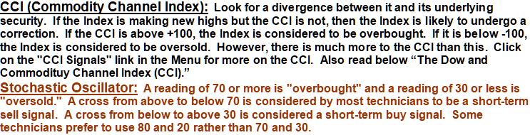
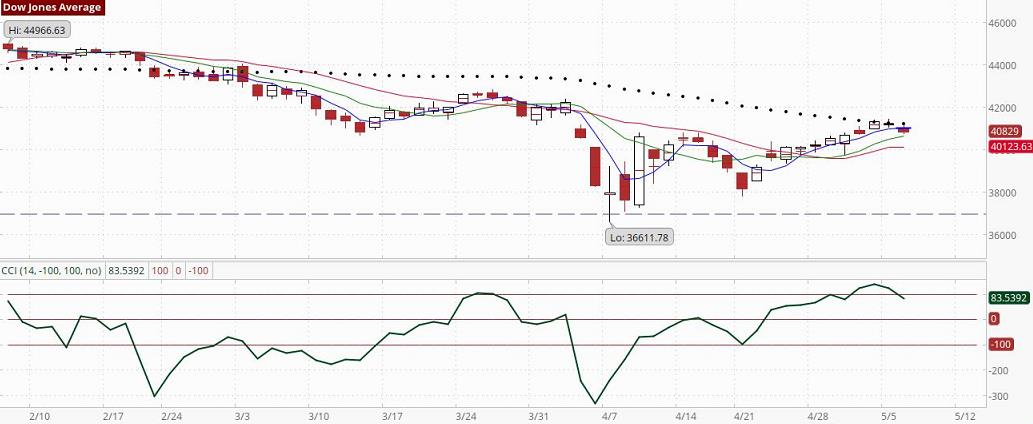 Traders profit most when they can buy early when a stock begins to trend and sell early when that trend comes to an end. The CCI can be a great help in spotting these trend changes. It examines current prices in the light of past prices without artificially distorting the raw data. For example, it uses a simple average rather than over-weighting data at one end of the measurement period. Comparing current prices to a simple moving average also provides a moving reference point (it always reflects current conditions). The equation for the CCI uses a divisor that adjusts to reflect price variability. This divisor is smaller when the stock is non-trending (when the stock exhibits less variability) and larger when a breakout occurs (when the stock exhibits large variability). Thus, it reflects both prices and patterns of price fluctuation. Statistically, such numbers are called “measurements of variability.”
The “current price” is not the closing price but the average of the high, low, and close (see the green line in the chart of the Dow). The divisor (or “measurement of variability”) is the average amount by which the “current price” deviates from the moving average of the “current price” during the period of measurement. The CCI computation is scaled so that 70% to 80% of the random fluctuations fall between –100 and +100.
When Don Lambert developed the CCI, tests were performed for the 5-, 10- 15- and 20-day periods of measurement. He found that although shorter periods like the 10-day CCI detected tops well for a variety of trend lengths, it was not as good at detecting “breakouts.” Also, a surprising characteristic of the indicator is the frequency with which it gives an exit signal at or before the extreme price rather than after the extreme price as with other indicators. To avoid the excessive whipsawing likely with the short periods of measurement, Lambert settled on 20 days as his standard period of measurement. We plot the 14-day CCI as a good compromise, avoiding the many whipsaws of the 5-day and 10-day periods but having more sensitivity than the 20-day period.
Our chart shows horizontal lines at +100 and –100 and outside these lines are two others at +200 and –200 respectively. We consider the latter to be extreme readings. The zero line is green. The rules for trading with the CCI were originally designed for short-term commodity traders. When the CCI crossed above the +100 line it was a buy signal. When it fell below that line it was a sell signal. Similarly, a short sale would be entered when the CCI crossed below -100 and it would be closed out when the CCI crossed above –100. The thinking was that these regions represented occasions when momentum was relatively high and when small profits could be captured in a few days. Since the CCI was originally formulated, other ways of using it have been found. Here are some of the ways it is used.
Buy when the line moves above –100 from below and sell when it drops below +100 or any time it rises above +200. If it does rise above +200, some traders prefer to wait until it drops below that level to sell.
Buy whenever the line crosses below –200 or wait until it crosses back above –200. Sell when it crosses from above to below +100.
Sell or buy when it crosses an uptrend line or downtrend line respectively (referring to trendlines on the CCI chart). Buy when the CCI bounces off of the zero line. When the CCI reaches the zero line, the stock’s average price is at the moving average used in computing the CCI, or (H+L+C)/3. Therefore, a bounce off the 14-day CCI zero line occurs when the stock bounces off its own 14-day moving average (that is, the moving average of its daily average price). This is often considered to be a good time to buy because the stock has not only pulled back to its short-term support (providing a relatively low entry price) but it has also reaffirmed its upward trend by bouncing off the average.
Chart patterns normally associated with price data have the same implications when they are found in CCI charts. For example, the head-and-shoulders top consists of 3 highs with the center high greater than the highs on either side. The head-and-shoulders bottom consists of 3 lows with the center low below the lows on either side. When the price of a stock crosses below such a line on a price chart, it is considered a sell signal. The same is true when this happens on a CCI chart (notice how the stock dropped when the crossover occurred on the CCI. Likewise, an upside-down or inverted head-and-shoulders pattern can give a buy signal. A crossover of the neckline of an inverted head-and-shoulders pattern on the CCI would be the triggering event. Comparing the CCI to the chart of the stock and analyzing the pattern of the CCI in conjunction with the pattern of the stock can give remarkable insight into the stock’s behavior and greatly help in the timing of purchases and sales. The CCI can be uncannily predictive.
The indicator is not perfect. Sometimes there will be false signals. These can be addressed by waiting for a greater move above or below the line, by waiting a day or two to see if the CCI reverses. Also, it is well to remember that the CCI can be used in combination with other indicators and in conjunction with an analysis of the price pattern itself. The CCI crossing above the –100 line while the stock price hits a savagely declining 20-day average, for example, might cause a trader to wait and see what happens. That 20-day average represents resistance. The odds are that the stock will bounce off the average and decline again. On the other hand, if the 20-day moving average is slowing down in its descent or leveling off, the stock could very well penetrate it. More information on CCI signals and examples
What to Expect
These expectations are based on probability assessments as of the time of posting. When they are posted in the morning, there is a chance that sentiment and investment bias can change later in the day, but the odd are that any changes will not be enough to alter this outlook. Changes overnight are more likely to change this outlook, because of news events that occur while the market is closed. For example, during the day, there could be news items that may result in a selling bias , or a sentiment of concern could arise near the close of the trading day. That emerging bias or change in sentiment will usually be reflected in behavior patterns that are detected by our system’s algorithms, even if they are quite subtle. Our algorithms will then generate a probability assessment in response to the most recent data available at the time. For example, after reconsidering the news or events overnight, investors may decide, for no apparent reason, that their concerns were overblown, or too weak, causing a sentiment reversal. Our projections are not infallible, but more often than not, they will be correct
Market Status Report
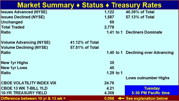 Explanation regarding interest rates
When short-term rates are 1.3% to 2% below long-term rates, the difference is positive, and investors expect normal economic growth (2-3 percent per year). When the spread is greater, they expect even faster growth because the Central Bank is likely pushing rates down. This reduces the cost of borrowing for companies so they can expand capital investment. When short-term rates are higher than long-term rates, Central Banks are probably trying to curb inflation. Economic conditions are expected to deteriorate. When short-term rates exceed long-term rates by 1.5% or more, there is a 70% chance the economy will go into recession within the next 12-months. The foregoing can serve as an investment guide. If short-term rates are higher than long-term rates, tighten stops or take other protective measures. If they are 1% or more higher, consider moving to cash (the short-term curve was this far above the long-term curve in 2000 and a 3-year bear market began in that year). When short-term rates are less than 1% below long-term rates, stable growth stocks are attractive. When short-term rates are 1% to 3% less than long-term rates, stocks are even more attractive (a stock-picker’s market). If the spread is more than 3%, invest with the premise that inflation could start to heat up soon.

Group Pressure Gradient
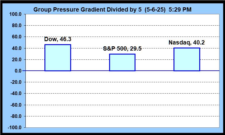
 The market has an effect on shares analogous to the effect of air currents on an airplane. The greater the speed of the wind counter to the direction of the plane, the more difficult it is for a plane to make headway. However, a plane moving in the direction of the wind will find it much easier it to make headway and to gain speed. An airplane has its own driving force, but the plane’s environment exerts its external force on the plane. Likewise, shares have their own motion based on supply/demand and sentiment considerations pertaining to those shares, but the environment in which the shares exist exerts forces on the shares that are unrelated to the merits of specific shares within that environment. We refer to this “force” as the “Group Pressure Gradient.” A Group Pressure Gradient reading near zero might be compared to flying on a windless or near windless day, and a reading of 28 might be compared to flying with a gentle to moderate tail wind. To continue the analogy, a reading of 28 to 57 might be compared to flying with a moderate to strong tail wind, while a reading of 57 to 85 would be like flying with strong winds to gale level tail winds. Negative readings would reverse the above comparisons. Of course the analogy is not perfect because a pilot would not want to fly in gale winds, but we certainly would not mind investing in shares when the market is registering 57 to100 on the pressure gradient scale. The Group Pressure Gradient has both magnitude and direction. Hence, it is a vector. A river or stream has many currents, cross-currents, counter-currents, eddies, and minor whirlpools. If a person wants to know what the pressure gradients are in a stream, he must select a specific spot in the stream to conduct his measurements. The same thing applies to pressure gradients in the stock market. To measure a pressure gradient, it is necessary to select a specific group of stocks within the market. We are currently calculating this indicator for three groups of stocks: stocks in the Dow, stocks included in the Nasdaq Composite Index, and stocks that make up the S&P500 index (the last time we checked, the S&P500 consisted of 50.8% mid-cap, 45.4% large-cap, and the rest were small-cap). Measurements are not made for individual stocks in isolation. It is the general environment of the stocks in these groups that is being measured. Please be aware that some big-cap blue-chip stocks are in all three of our benchmarks (the Dow, in the S&P500, and on the Nasdaq), and each grouping has its own group pressure gradient. Therefore, when a stock is in more than one group, it is best to consider each environment but give the strongest weighting to that of the Dow (because the Dow has the greatest relative concentration of investors in blue-chips who also represent the biggest relative concentration of big money). If you are not investing in blue-chips, then you might give more weighting to the S&P 500. If you are investing in a portfolio of technology stocks, then give emphasis to the reading for the Nasdaq. Usually the groups have similar readings, but sometimes they are quite different. The GPG of a group may decline while the corresponding Index rises, or rise wile the corresponding Index declines. Also, individual stocks within a group can surge (because of a news event, for example), even when there is a negative pressure gradient.
The indicator is extremely sensitive and can change dramatically from day to day. It might be best to think of it as measuring the current status of the pressure gradient. Earlier, we gave the analogy of an airplane flying with or against the wind. Bear in mind that air currents are constantly shifting in direction and intensity. An airplane often encounters gusts of wind. Similarly, this indicator will occasionally reflect “gusts” and reversals. In other words, the indicator can sometimes be volatile on a daily basis. After observing it for a few days, a general pattern may emerge. It may become evident that the indicator tends to show pressures more often in one direction than in the opposite direction. The pressure gradients can become progressively stronger or weaker. This can be very helpful information for short-term to intermediate-term investors. While it is possible to smooth the readings (make them less volatile), doing so would reduce sensitivity. The indicator is relatively new (first introduced on 6/3/15). If we get enough requests for less sensitivity, we can modify it to accomplish that. We wanted to make the indicator sensitive initially because the high sensitivity suited our own purposes at the time. Computational details are currently proprietary.
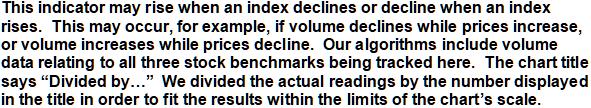
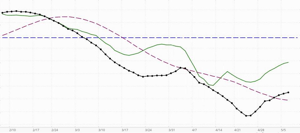
This is updated daily. When the black line with dots (the indicator line) is above the horizontal blue line, this indicator is telling us that the market has a positive or bullish bias (in the short-term to intermediate-term, even if not in the long-term). If the black dotted line is declining toward the horizontal line, bullish sentiment is decreasing but still present. A negative or bearish bias will be indicated when the black line crosses below the horizontal line.
Assume, that the market has a positive bias (the black line is above zero). If the green line is rising, it is confirming that the environment is supporting bullishness. In this case, long-term and intermediate-term investors who take bearish positions will be in an environment that is working against them. A declining green line in a market with a positive bias means the positive bias is not currently being confirmed … the MBI is detecting counter-currents of negative momentum that are not yet significant enough to change the market’s positive bias status. That means investors may find situations where bearish positions can be taken with somewhat less risk than when the market has a confirmed bullish bias, but because the general environment is bullish, there is still risk in taking bearish positions. Great caution is recommended. Money can be made only on carefully selected bearish positions taken by short-term or intermediate-term investor/traders who know how to trade bearish positions in a market with a positive bias. If the black indicator line crosses below the dark red dashed line, it means that the bearish sentiment is becoming more significant, but since the black line is still above zero, probabilities still favor bullish positioning. In this environment, carefully selected bearish positions are more likely to be profitable than before the black line crossed below the dashed line. From the perspective of an experienced short-term trader, the non-confirmed reading is giving a “go-ahead” for quick bearish trades. Here, the indicator would be giving nuanced information a level deeper than most indicators. If the market has a positive bias, a green line turning down merely means the conditions are not “optimal” for short-term bullish positions. That does not mean they cannot be very profitable if carefully chosen. However, a downturn of the green line in a market with a negative bias is much more problematic for bullish positioning, even for very short-term traders.
Assume, that the market has a negative bias (the black line is below zero). If the green line is declining, it is confirming that the environment is supporting bearishness. In this case, long-term and intermediate-term investors who take bullish positions will be in an environment that is working against them. A rising green line in a market with a negative bias means the negative bias is not currently being confirmed … the MBI is detecting counter-currents of positive momentum that are not yet significant enough to change the market’s negative bias status. That means investors may find situations where bullish positions can be taken with somewhat less risk than when the market has a confirmed bearish bias, but because the general environment is bearish, there is still risk in taking bullish positions. Great caution is recommended. Money can be made only on carefully selected bullish positions taken by short-term or intermediate-term investor/traders who know how to trade bullish positions in a market with a negative bias. If the black indicator line crosses above the dark red dashed line, it means that the bullish sentiment is becoming more significant, but since the black line is still below zero, probabilities still favor bearish positioning. In this environment, carefully selected bullish positions are more likely to be profitable than before the black line crossed above the dashed line. From the perspective of an experienced short-term trader, the non-confirmed reading is giving a “go-ahead” for quick bullish trades. Here, again, the indicator would be giving nuanced information a level deeper than most indicators. In a market with a negative bias, a rising green line is letting an investor know that if they are very careful, there are some opportunities. For example, a setup pattern could offer a good opportunity for a 1-week price surge [a pre-surge “setup” pattern is meant here. For more on these patterns see the bottom half of the Stock Alerts page on this site]. A swing-trader may take such a position to participate in the surge and sell immediately as the surge loses momentum. These trades can enable a person to capture a gain of maybe 3% to 12% and sometimes much more than that (we have captured more than 30% in a single day).
As for the green line, its position above or below either the black Indicator line (or Dashed red line) is not relevant. It is the direction of the green line, not its position, that is relevant.
The dashed red line can be used in combination with the black dotted line as a short-term buy/sell signal generator, but all signals must be confirmed by the green confirmation line. For example, say the black dotted line is below the horizontal line (indicating a negative market bias), and it crosses above the dashed dark-red line. If, at the same time, the green line is rising, then a cross above the red line may be interpreted as a buy signal in a negative environment for a short-term trade. All such signals must be viewed with respect to the prevailing context and the risks implied by the current configurations. Nothing on this Website should be interpreted as a buy or sell recommendation. Our indicators may generate buy or sell signals, but never buy or sell recommendations.
So, what if the Indicator line is above zero (indicating a positive bias), but it has crossed below the broken red line? If the green line is declining, it is confirming that bearish positions can be taken within the bullish environment. However, it must be remembered that risk is higher than if the market has a bearish bias. If the green line is rising, it is not confirming the short-term sell signal created by the Indicator line crossing below the red dashed line. Instead, it is confirming the positive bias indicated by the black indicator line’s position above the zero line.
On the other hand, if the Indicator line is below zero (indicating a negative bias), but it has crossed above the broken red line, simply reverse what was said in the above comments. This indicator is sensitive. For example, it gave a “sell signal” two days before the market meltdown in 1987. More information on MBI
McClellan Oscillator & Summation Index
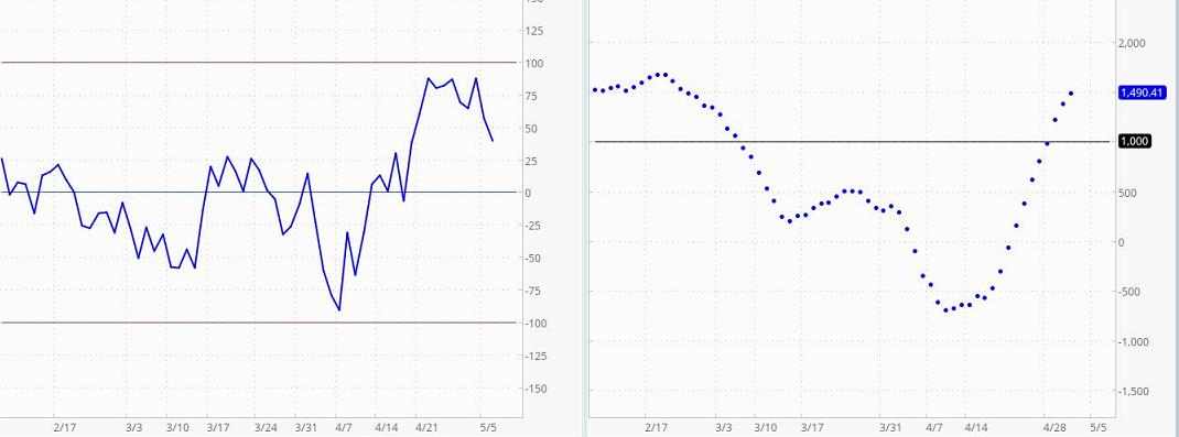
The McClellan Oscillator is a breadth-of-market indicator that is effective for interpreting short-to-intermediate-term market moves. The McClellan Summation Index (bottom chart) is a running total of each day’s McClellan Oscillator value. The Summation Index is effective for interpreting intermediate to long-term market moves. Together, they can be useful in evaluating the dynamics of the ebb and flow of the market, and in planning entry and exit points. The readings indicated depend on the precise time the readings were taken. For example, after the market officially closes, stock prices may continue changing by small amounts for a short time as computer systems catch up with closing activity. Readings at the official closing time may be slightly different from those 15 minutes after the close. Thus, different sources may report slightly different readings. Another variation is caused by differences in the beginning date of the accumulated data. These variations are not particularly important. What is important is the pattern of each indicator. Even though different sources may provide somewhat different numbers, the chart patterns from any two sources will be nearly identical.
McClellan Oscillator readings of ±150 are extreme and tend to correlate well with buying and selling climaxes in the market. The McClellan Oscillator reaches these extreme values, measuring overbought and oversold conditions, in advance of market turns. It then passes through zero (the black dotted line) at or very soon after market turning points (to put this in perspective, extreme readings occur much less frequently than a pass through zero. McClellan Oscillator passes through zero tend to indicate market reversals at approximately 2 to 6 week intervals). The type of action to be taken, if any, depends on the major trend of the market (as indicated, for example, by 50 and 200-day moving averages) and on whether the move originated from an extreme reading. Thus, in the early and middle phases of a bull market emphasis might best be placed on buy signals. In a bull market, buy signals occur earlier, and positions can be taken when the McClellan Oscillator clearly moves out of its basing pattern, even if it is still negative. In a bear market, sell signals occur when the oscillator moves clearly out of a topping formation, even if it is still positive. The amplitude of the oscillations above and below zero correlates with the general volatility of the market. The oscillator shows distinct cycles (lasting 22 to 24 weeks) between significant bottoming formations. Divergence between oscillator moves and conventional market indicators forecasts an impending change in market direction. Conventional trendline theory can be applied to oscillator patterns. For example, a triple top formation in the McClellan Oscillator forecasts a termination of the preceding up-trend.
The Summation Index is a relative number, depending on the day when the count begins. Therefore, on one day it might read 10,000 and the next day it might read 9,000 even though the chart shows the Index rising. In this case, the apparent discrepancy would simply be the result of the summation starting on a later day for the chart selected. You can get a better sense of what is going on by simply looking at the chart. Ask yourself questions like the following. Is the Summation Index rising or falling? Are the postings far apart or close together? For example, if the Summation Index is rising (or declining), it is intermediate-term bullish (bearish if declining) and the market’s trend is up (down if the Summation Index is declining). If the Summation Index is declining, the first positive sign will be a slight narrowing of the gaps between postings. The second positive sign the Summation Index will give is a flattening out of the entries (this stage is sometimes skipped). The third positive sign is a reversal in direction. The final positive sign is a slight increase in the distance between postings. Some investors use the latter as a buy signal (alternatively, some may use the second posting in the new direction as an early buy signal). They view the opposite conditions as negative, culminating in a sell signal.
Explanation Of Pivot Points
A pivot point is a price level that is used by traders as a predictive indicator of market movement. Pivot points, and their associated support and resistance levels, are often turning points in the direction of price movement. Prices tend to swing between two pivot point levels. For example, if a price is right at the first level of support (“Support 1”), the probability is that it will move back toward the next higher “resistance pivot point” These levels are very weak, and have most relevance for intraday action. In an up-trending stock or index, the next higher pivot point (a resistance level) may represent a ceiling level in price above which the uptrend is no longer sustainable and a reversal may occur. In a declining market, the next lower pivot point (a support level) may represent a low price level of stability or a resistance to further decline. Pivot points were originally used by floor traders in setting key levels. Before the market opened, floor traders would calculate the pivot points for the day. With these pivot points as the base, additional calculations were used to set support 1, support 2, resistance 1 and resistance 2. These levels could then be used as trading aids throughout the day. The resistance levels are where sellers are likely to enter the market, depressing prices. Therefore, it is significant if a stock can push its way through the selling pressure. It takes buying demand to push shares higher through levels at which sellers are waiting. Likewise, the support levels are where buyers are likely to enter the market, exerting upside pressure on prices. Therefore, it is significant if a stock declines through the buying pressure. It takes significant share selling for shares to continue dropping, even through levels at which buyers are waiting. The price of a security or Index will remain between pivot support 3 (S3) and pivot resistance 3 (R3) 80% – 85% of the time. Therefore, many traders will wait for a move toward either R3 or S3 to show signs of stalling. When the stalling is evident, they will buy a stock that has been declining toward S3 or sell a stock that has been rising toward R3.
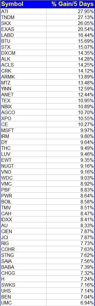
Keep It Simple Strategy
First, consider the S&P 500. It consists of a mix of small-cap, mid-cap, and large-cap stocks. More than half are mid-cap or small cap. However, because of the way they are weighted in computing the Index (more weight is given to the large cap stocks), the S&P500 is considered by many to be a large cap Index. However, with the following strategy, you are not investing in the Index as it is weighted. Instead, you would be investing in individual stocks drawn from a pool consisting of stocks having a wide range of market capitalizations. As of August 2024, the S&P 500’s total return over the last 10 years is 325.1%, with an average annualized return of 15.6%. This does NOT include dividends. There can be a great deal of fluctuation from year to year, but historically, average returns over various stretches of time have been respectable.
Consider the fact that the return for each year is the result of the pluses and minuses contributed to the Index by each of the stocks in it. An index return of 15% might be the result of some stocks rising 20% or 30% or more and other stocks declining enough to drop the total gain of the Index to 15%. The net return would be the result after falling stocks have canceled out some of the performance of the rising stocks. There may even be more declining stocks than rising stocks, causing the Index to have a negative return even though many of the stocks in the index rose during the same period. Now, what do you think the average returns would be if an investor always had the strongest stocks in his portfolio, and there were no losers to cancel out the performance of the strong ones?
The Strategy
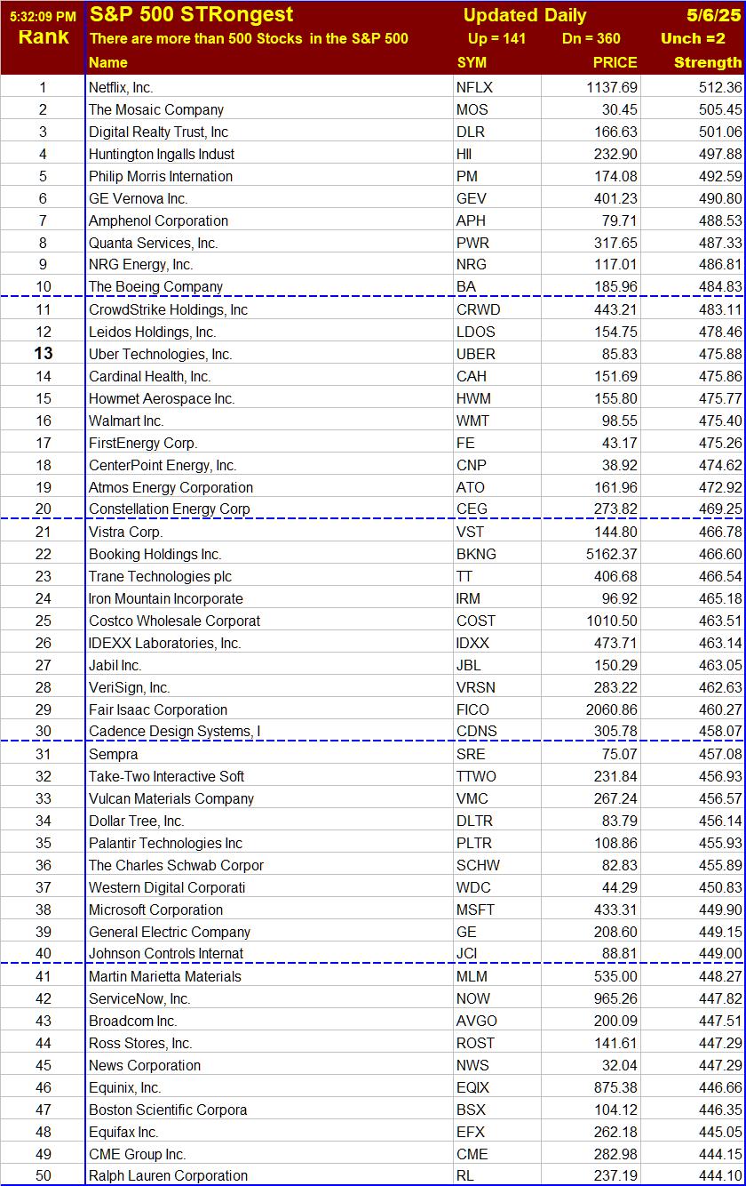
Each day we rank stocks that make up the S&P 500 and provide a list of the top 50 in strength. The investor can use the list in several ways. He might select the top ten out of the fifty for investment if he thinks they are suitable (the top 10 would be the strongest 2% of the 500 stocks in the Index). Once a week (or daily), he could replace any that fall out of the top 10, 20, 30, or whatever, with the stocks that have moved up to the top 10 (or 20). As you can see, there are many variations possible for the basic strategy. For example, you could keep the selected stocks until they fall out of the top 50 and then replace them with those in the top ten that you do not have. Or, you could make these adjustments once a month or once a quarter rather than once a week. Another approach is that you could pick and choose whatever catches your fancy from among the top 20, and replace them when they fall out of the top 20 or 50. An alternative sell strategy would be to sell those stocks that close below their lowest closing price of the previous 10 or 20 days, on the rationale that such stocks would probably no longer be in an uptrend. The could then be replaced by stocks in the top 10, 20, or whatever.
To cut down on excessive and meaningless trading, these strategies depend on a strength algorithm that finds more persistent strength than what is found by the Relative Strength Index (RSI). It should find stocks that are trending or beginning to trend. Also, we want the trend to have relative consistency of behavior. That is, we prefer to avoid having lists of stocks that have spiked up 50% overnight, though it may not be possible to filter out all of those. The RSI cannot satisfy these requirements, but we do have an algorithm that does. The other part of the strategy requires a universe of limited size but made up of respectable stocks (not a lot of penny stocks or new issues). That is why we focus on the S&P 500. It should be limited in size because using this strategy on a list of several thousand stocks would probably mean excessive (and meaningless) turnover. There would be too many candidates for each position, and rankings would probably change too often on unimportant differences.
Managing The List
We keep the basic list more stable than the makeup of the S&P 500, because the managers of the Index sometimes remove stocks that have excellent performance and outlook (because of weighting and balancing considerations). If they want one more stock in Finance, they might throw out a perfectly fine stock in Technology so the weightings would balance right for their model. Keeping the database more stable enables us to give better follow-up on stocks in which you may have invested (and stocks are less likely to disappear from the list suddenly without warning or obvious reason). Of course, if a stock is delisted or if its company is merged with another company we would want to replace it with another from the S&P 500. We just do not want to add or subtract stocks simply because of Index balancing considerations, because those are “artificial changes,” having no bearing on the quality of the company or the attractiveness of its stock. Also, we are not investing in the Index, but in individual stocks of relatively high quality. A few companies have more than one class of shares. We track one class of shares for each of those companies, limiting our list to 500 stocks. Also, if a stock is dropped from the S&P 500, we may not replace it immediately, so the list could consist of less than 500 stocks for some of the time between list updates. The lists are not recommendations to buy or sell. They are simply lists of stocks, having the highest ranking scores. Reports may be created mid-day, so prices are not always closing prices.
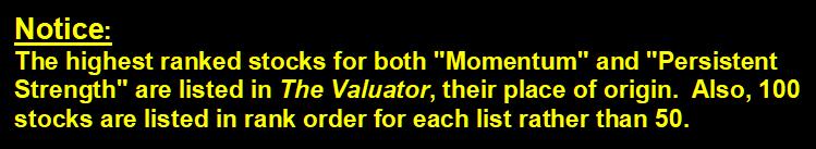
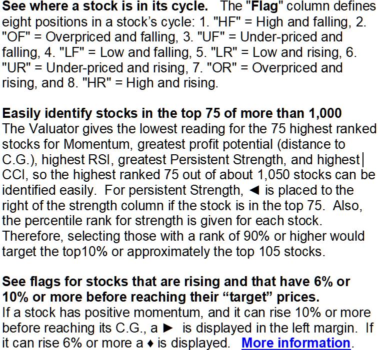
What’s In The Valuator?
Stocks With Highest Persistent Strength Ranking
See what this means
Stocks With Lowest PE-Ratios
Probable High and Low Price Range For Each Stock
Stocks With Lowest and Highest RSI
10-Day Momentum For each Stock
The ATR (Average True Range) For Each Stock
What Can I Do With The Valuator?
SETUPS: Increase your odds of making a profit by focusing on “setups,” chart configurations that are most often seen before a price surge. Be sure to wait for the “trigger event.” A “trigger event” is your buy signal, assuming there is not overhead resistance or other contrary indications. For more on setups, go the Q&A page and read item 13. Then use the link at the end of that explanation.
The Trading Result For One Of Our Traders
Long ago we proved to our own satisfaction (by trading with real money) that to obtain gains of more than 50% a year it is not necessary to invest in options, currencies, or commodities. It can be done simply by buying and selling stock. All you need is a good discipline (and that you actually follow your discipline). That is what this site is all about. We do not make a practice of revealing the performance of company traders. There is little reason to do so, and it is nobody’s business but our own. However, one of our traders has given permission for us to share her performance on a one-time basis.
After brokerage fees, her net return for the year was 58%. All she did to obtain this return was to buy and sell stocks in a very bad market. She simply cut losses quickly, focused on good setups, and looked for trigger events. When it was time to sell, she did not talk herself out of it or “argue” with the evidence. She also did not sit “glued” in front of her computer. She entered her trades and set her stop losses. Often, the only time she could check her positions was long after the market closed. She did not have to agonize about margined positions held overnight because they were not part of her discipline.
It might also be worth mentioning that to optimize liquidity, to minimize the spread between bid and ask, and for risk-control reasons, she prefers to avoid stocks that trade for less than $5. Most of the stocks she trades are followed in The Valuator. This trader is a very private person who does not want to report her returns every year, so there is no plan to update this performance in future years. This report was posted shortly after the data was available, and it will be left here for future visitors.
Please be aware that she did have major distractions during this year that almost certainly got in the way of her achieving a significantly greater return. In other words, this was by no means the best she could do. However, she allowed us to reveal her performance anyway in order to encourage others and to show that returns above 50% are achievable (even under less than ideal conditions). [Portfolio returns above 50% per year can be achieved by trading relatively high quality stocks priced above $5 in a cash account.
The discipline used by this trader is extremely low in risk, much lower than the risk assumed by the average mutual fund investor or the buy-and-hold investor in individual stocks. Yes, she could have achieved a much higher return if she had kept her positions highly leveraged. She does not wish to take that route. Greed destroys discipline. Here is a little known fact worth considering. 80% of the people who fully leverage their investments in the futures markets eventually lose all their money. Some people do well in the futures markets. The same can be said for some who trade penny stocks and currencies. However, it is not the use of leverage that makes a winner, but the use of a good discipline. Too many people don’t get that fact.
The discipline used to achieve the above return is our own creation. We do not make it available to the public as part of any service or training program. In other words, we are not providing this performance information to solicit your enrollment in any kind of program. It is provided only to encourage people to be diligent in the development of their own discipline. We will leave this report here to encourage others who may be wondering if working at developing a discipline is worth the effort.
========================================================
Silver – Gold – Platinum – Paladium
According to the source for the following, the spot price of gold is determined by the London bullion market twice a day – at 10:30am and at 3pm – London time (2:30 am & 7am Pacific time).